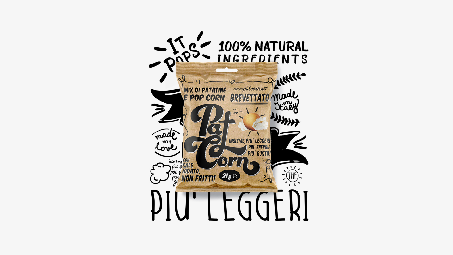
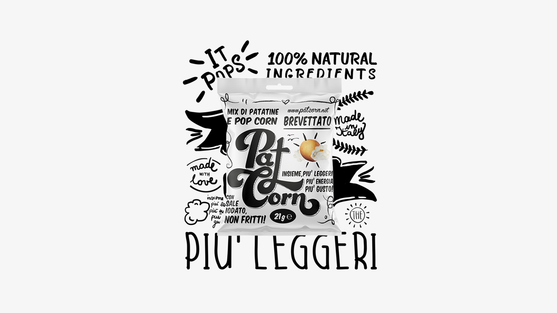
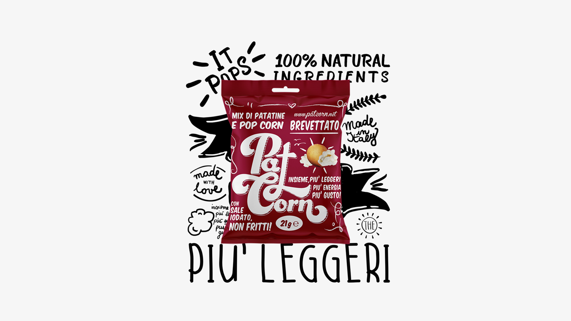
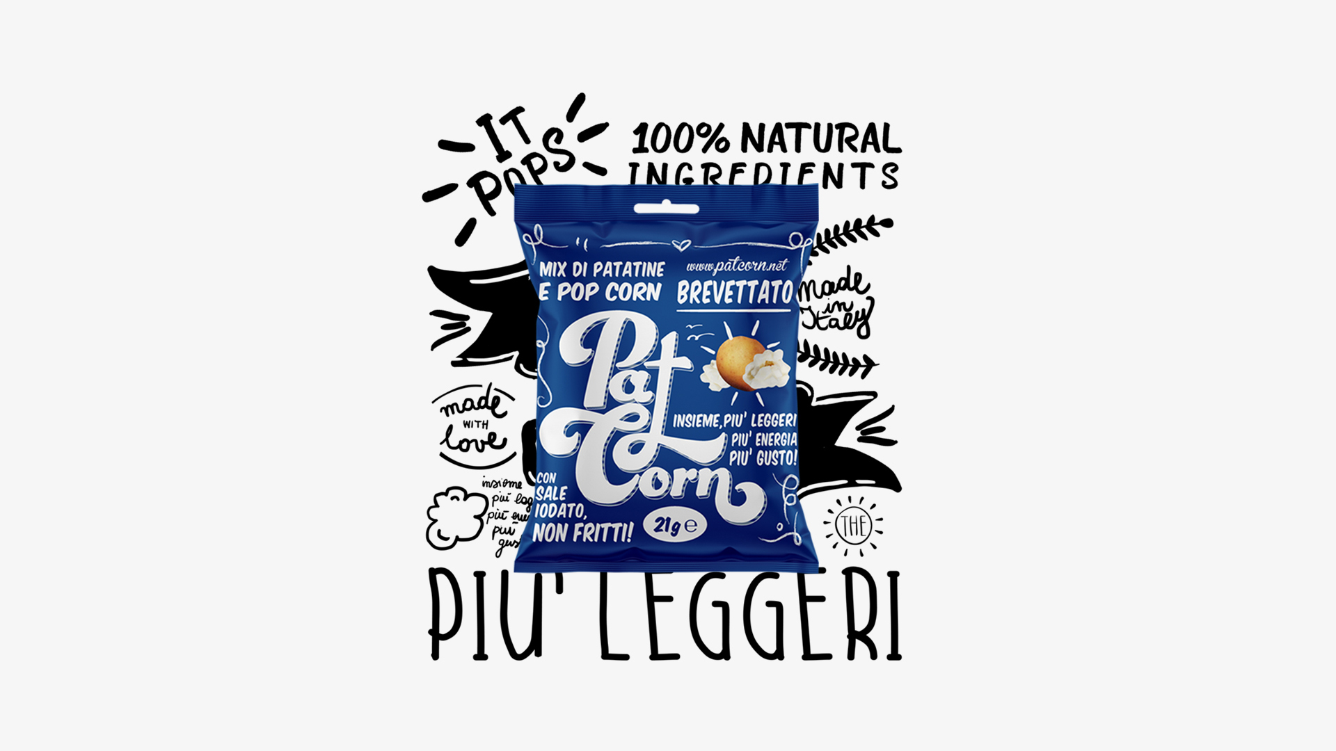
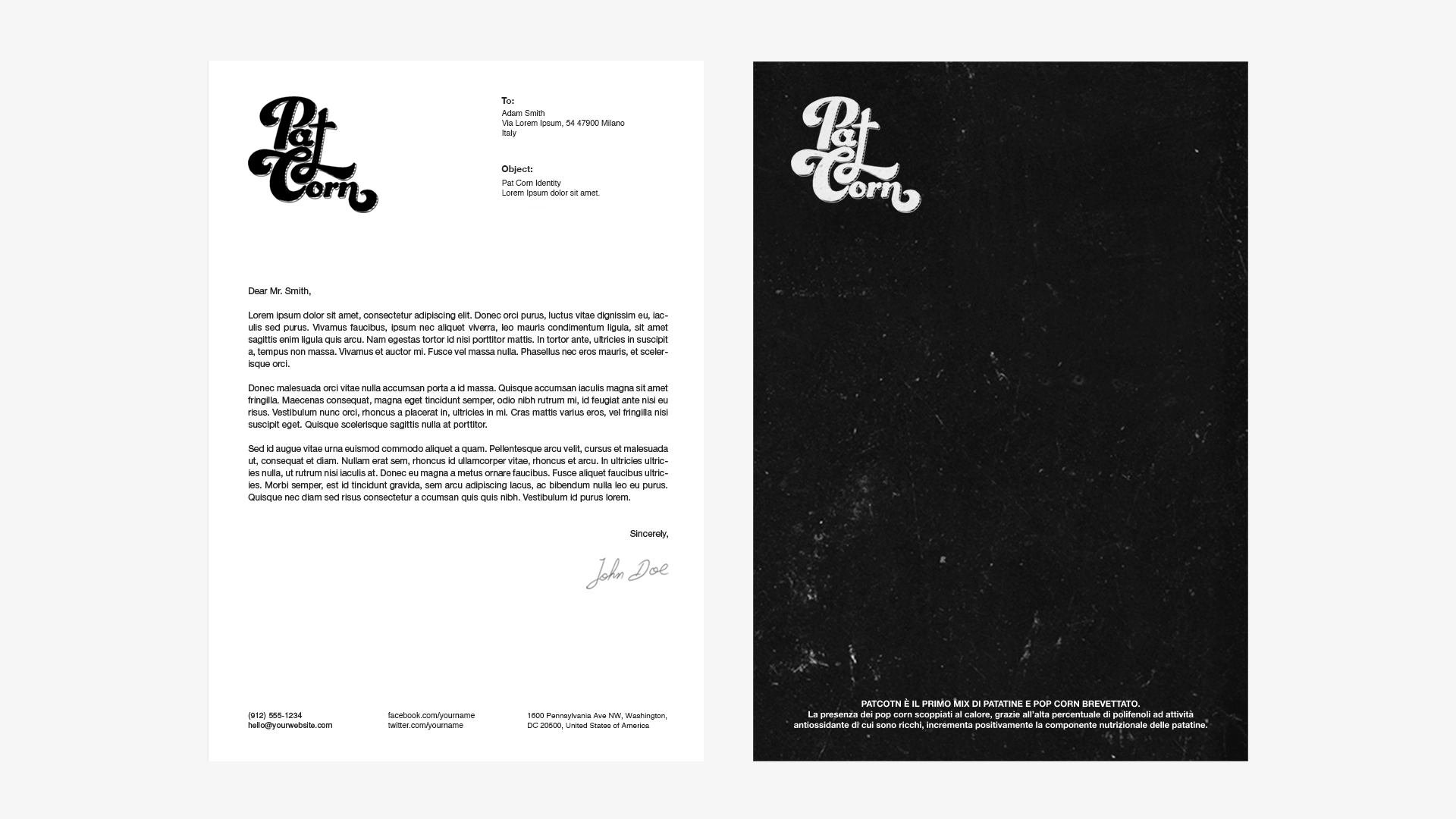
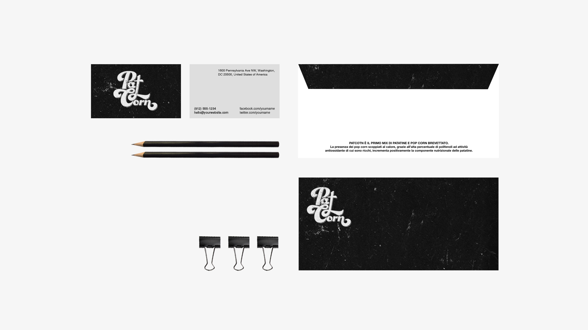
PATCORN
Branding and packaging concept design Patcorn, the first patented mix of chips and popcorns. The presence of heat-popped popcorns, thanks to their high percentage of polyphenols with antioxidant characteristics, positively enhances the nutritional components of the chips.
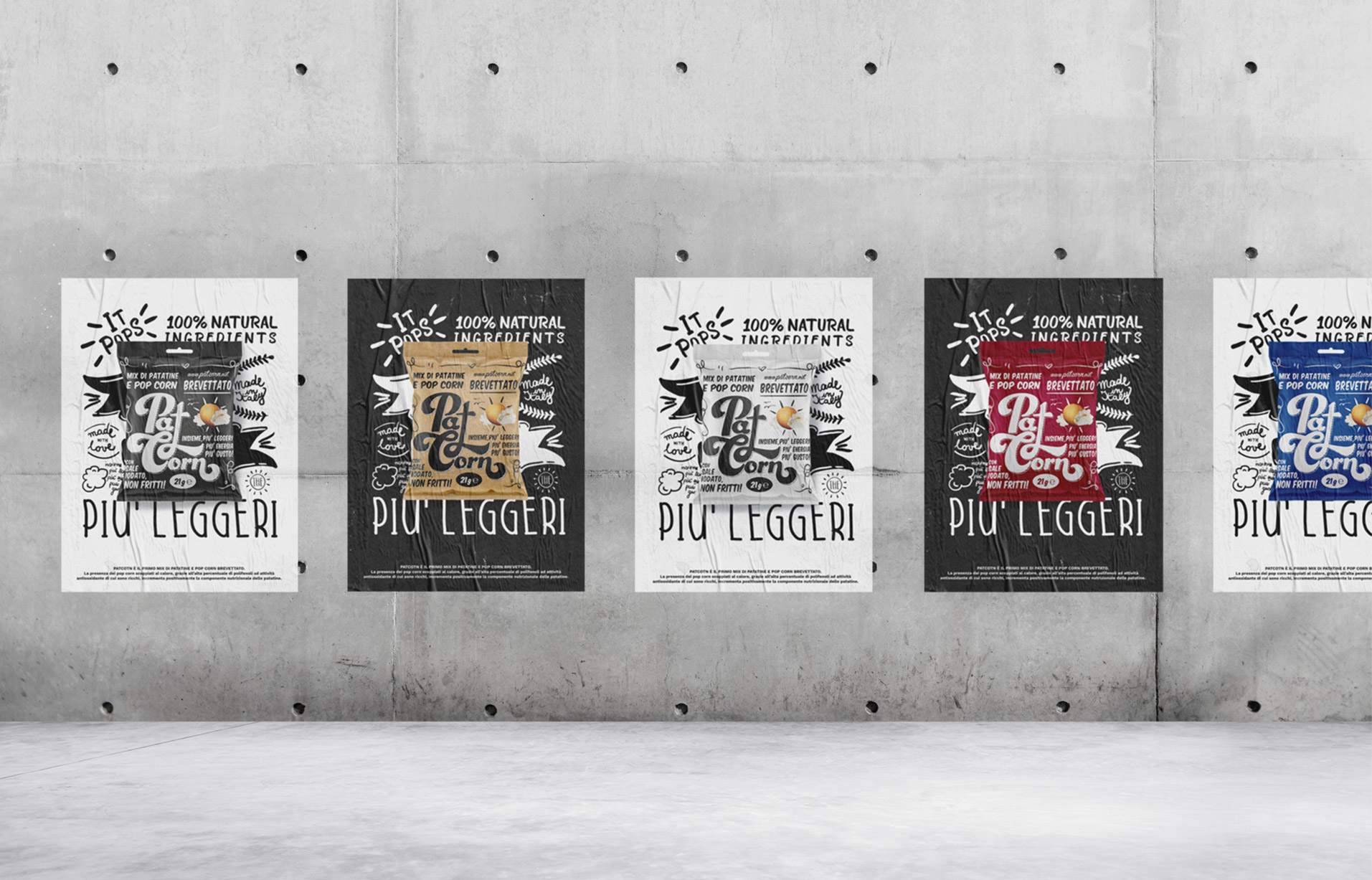
In this visual design version, the writing takes up most of the space. The logo, intentionally occupying the whole front packaging, is reminiscent of handwriting, just like the rest of the characters.
The collage-like image represents a potato tuber and a few popcorns with the appearance of sun and clouds (hence the idea of lightness). The tuber shows potatoes are not fried, thus the product is healthier. The solid-color variations make for an elegant, visible packaging, different from competitors’.
Client PATCORN | Studio Ciandreamy | Design – Art Direction – Packaging – Print Valentina Ciandrini