BALACCHI
Brand Identity for Sonia Balacchi World Champion Pastry Queen
Client BALACCHI Gelato | Caffè | Cioccolato (SB PASTRY S.r.l.) | Studio Ciandreamy | Branding — Visual Identity — Walls Design Valentina Ciandrini


Sonia Balacchi is the first woman to win the World Pastry Championship and the only Ambassador of Italian Pastry to the UN for the 2015 Italian Food Festival.
Then, with an internship at the Cast Alimenti school in Brescia, where he crossed paths with Biasetto, Vinciarelli, Bechoux, Torreblanca, Felder and others, she continues with experiences in Italy and abroad (such as at the starred Belmond Le Manoir aux Quat ‘Saison in Oxford).
Back in the province of Rimini, she is creating her own eco-sustainable farm for the organic products that she uses in her new shop:
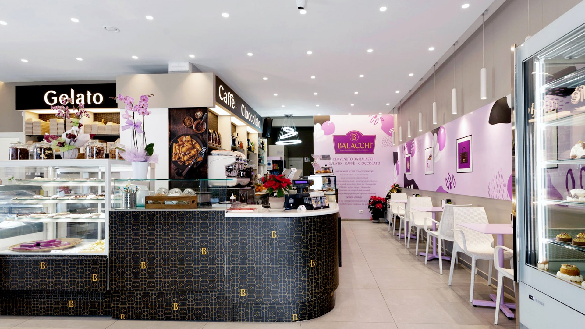
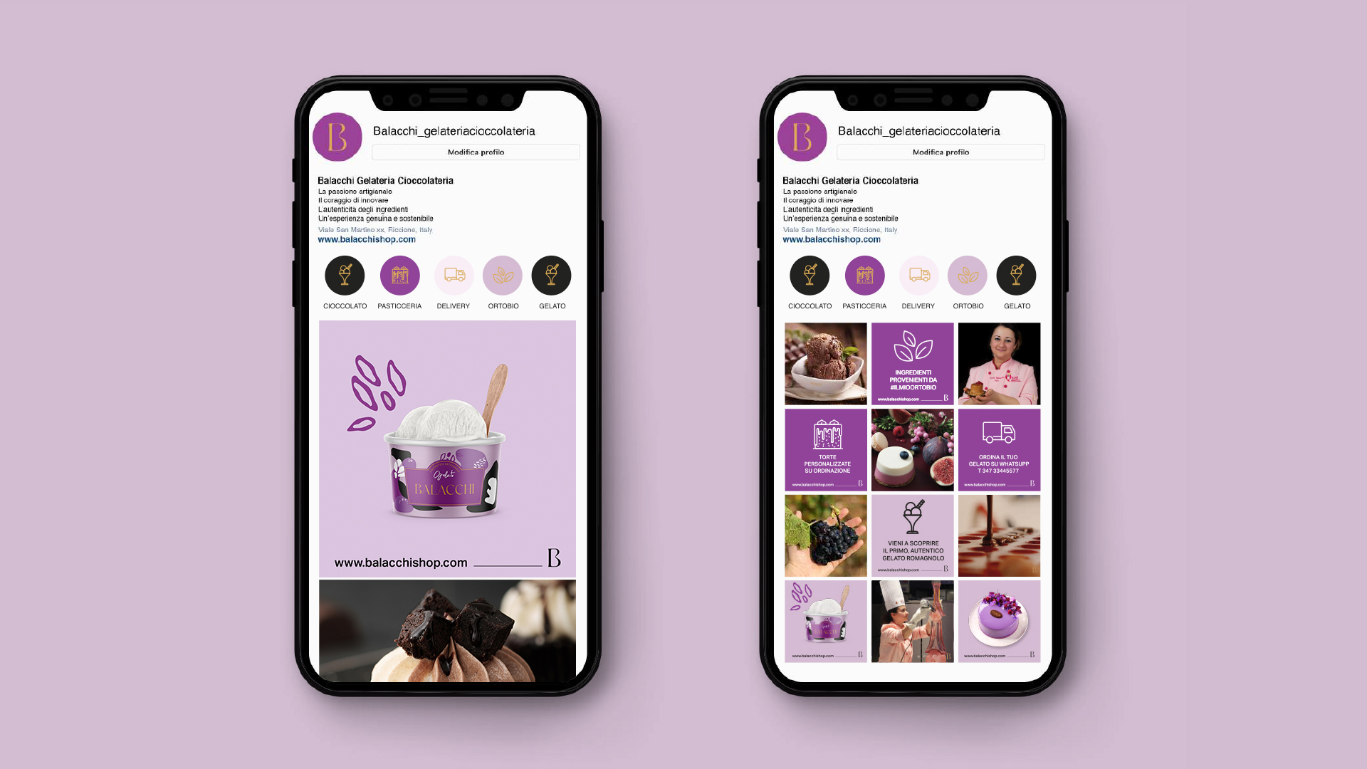
BALACCHI | Caffè | Gelato | Cioccolato is:
— Hight Quality
— Creativity
— Sustainability
— Authenticity of the Ingredients
— Innovation through Tradition
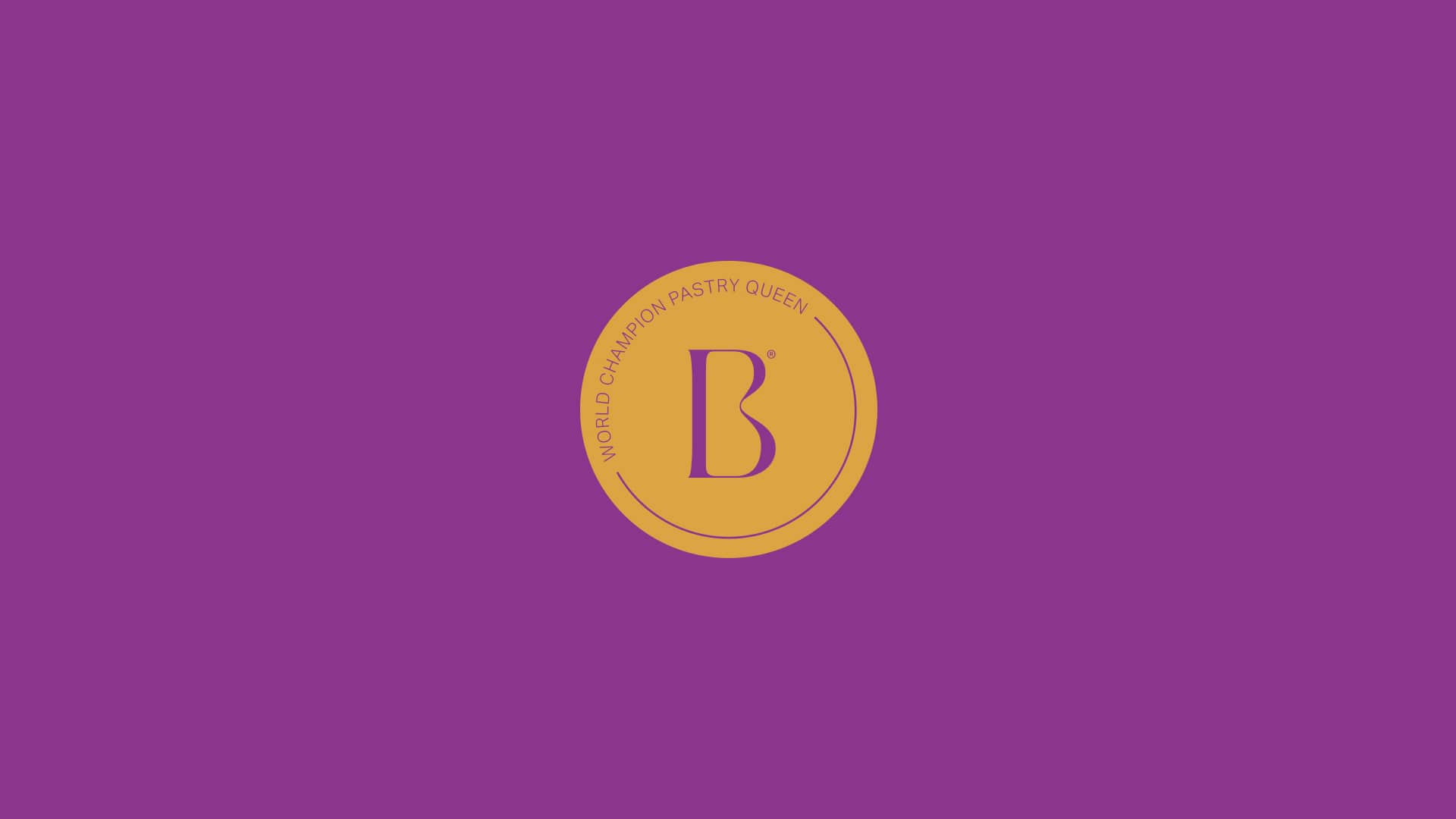
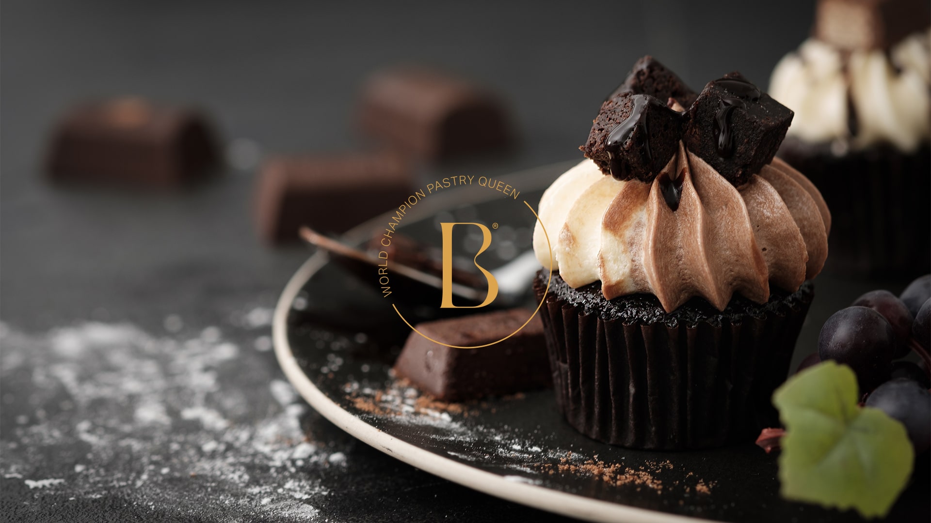
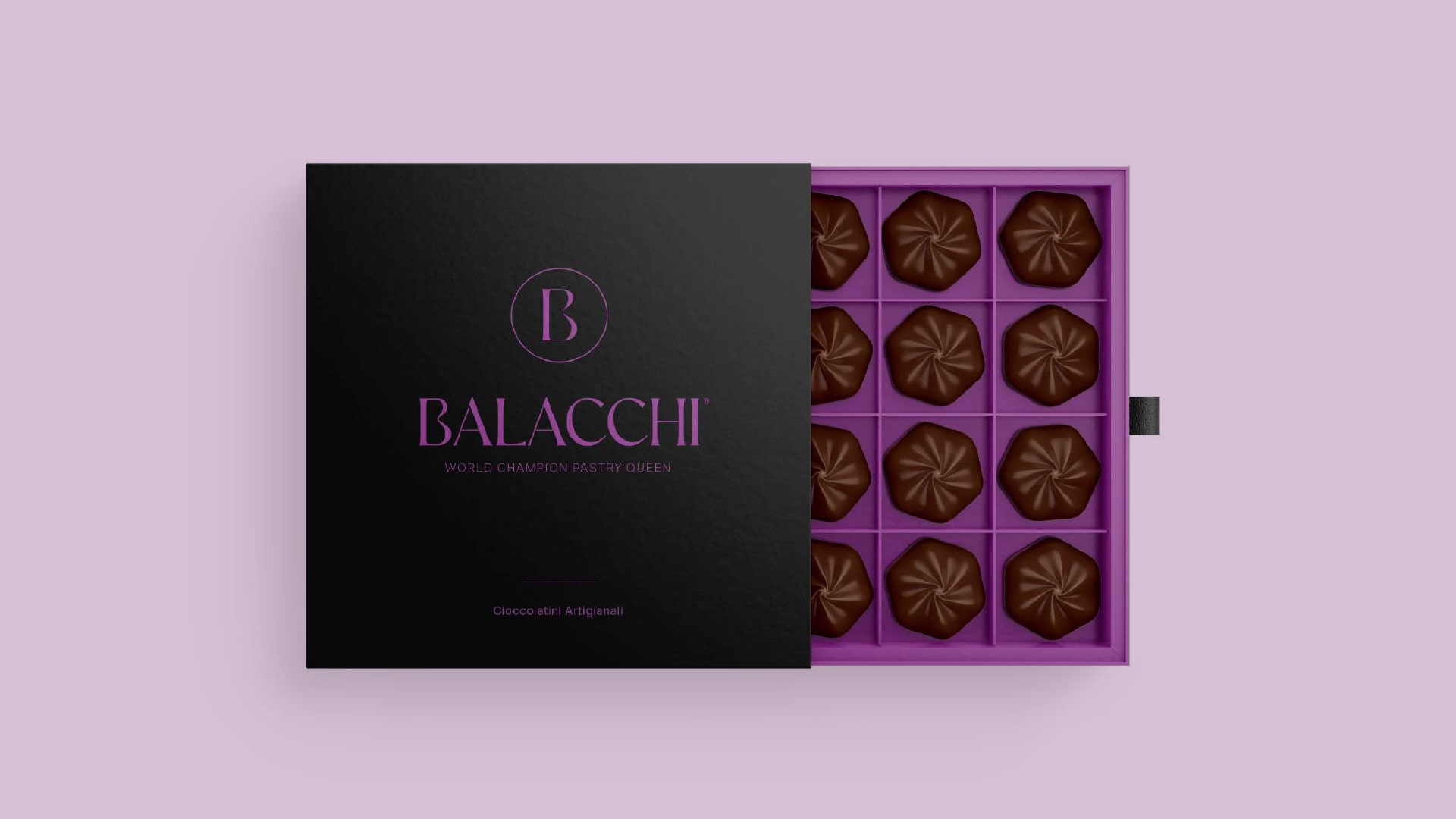
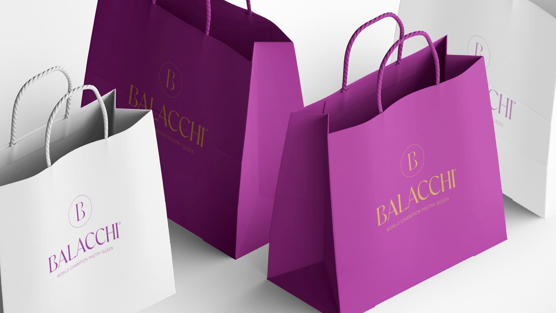
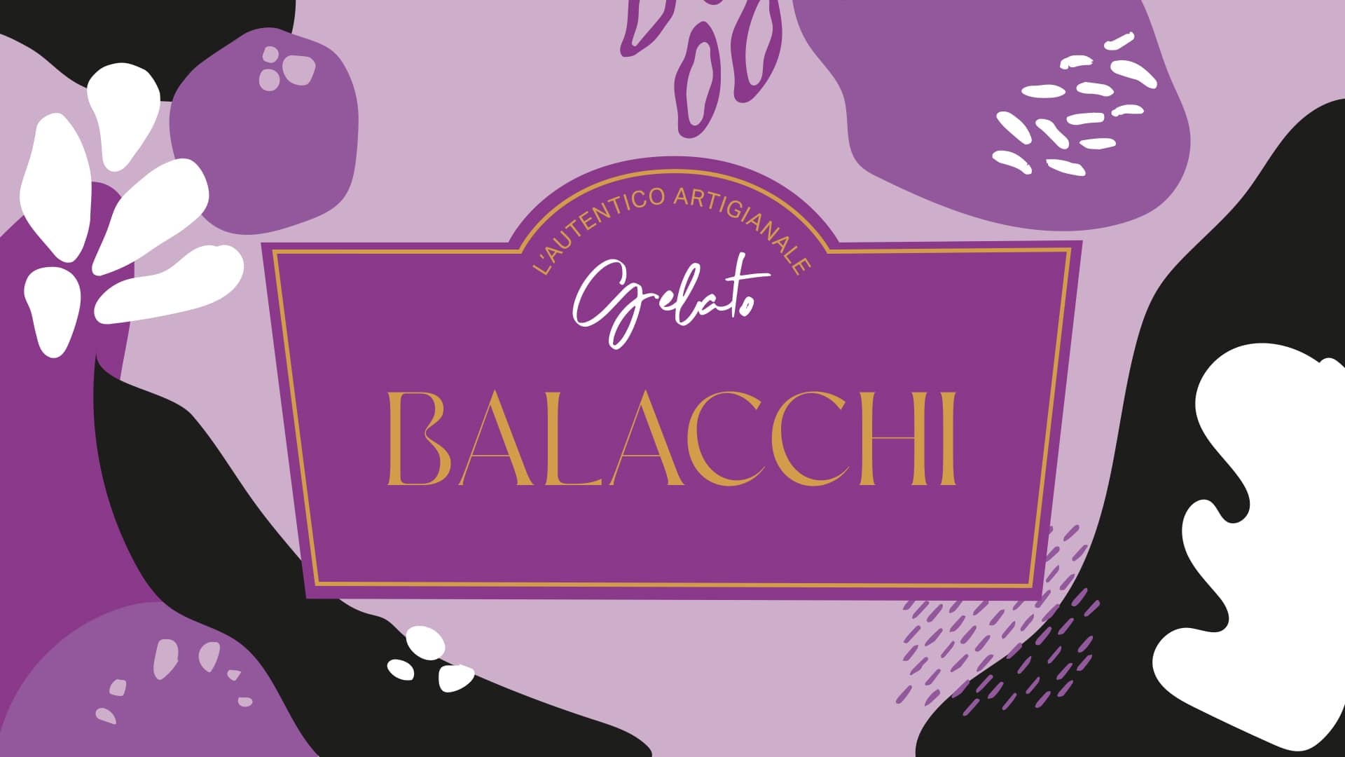
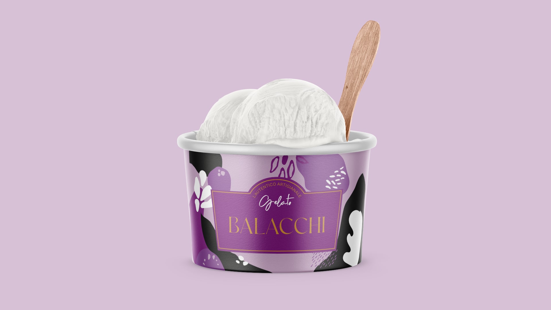
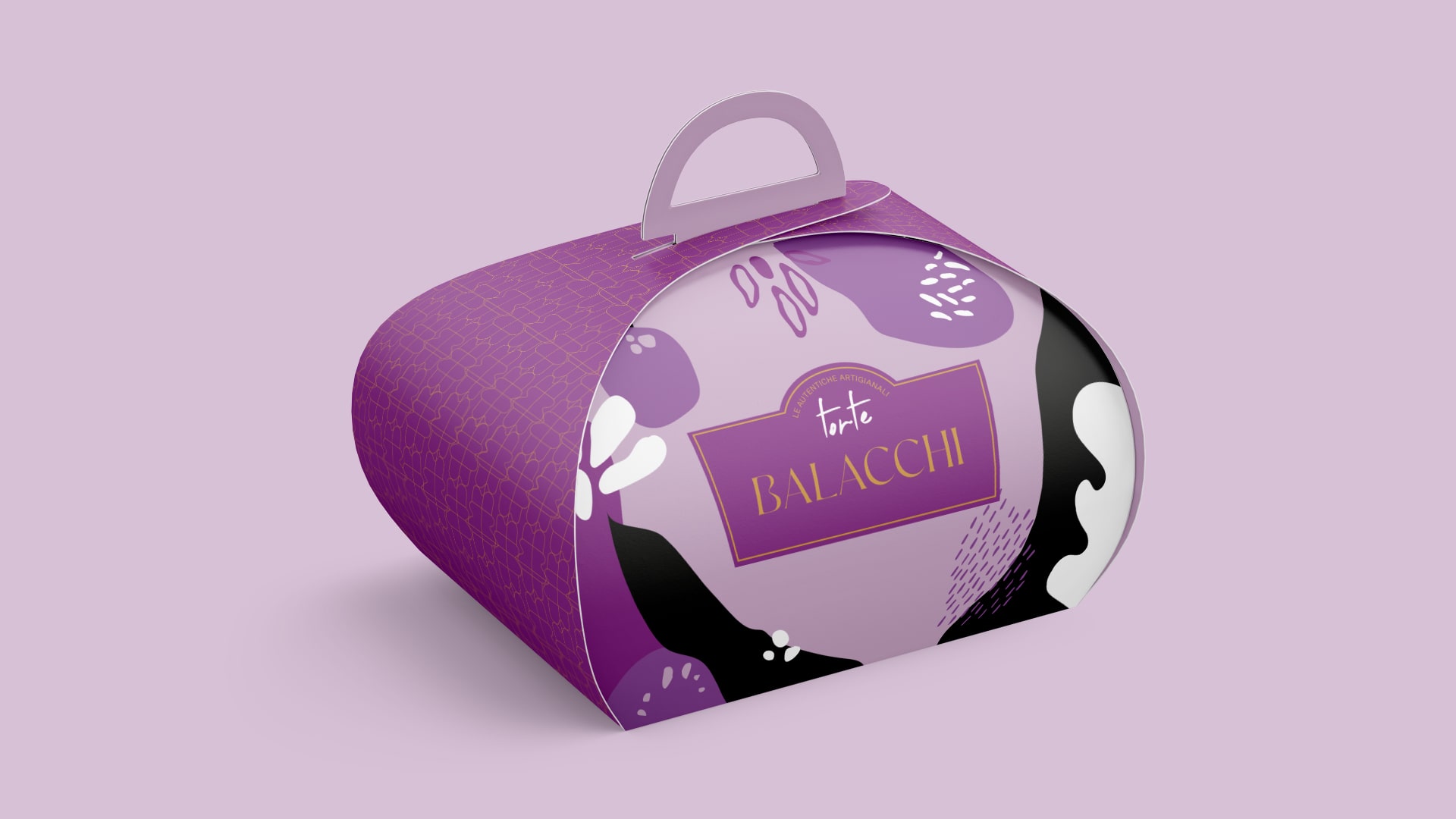
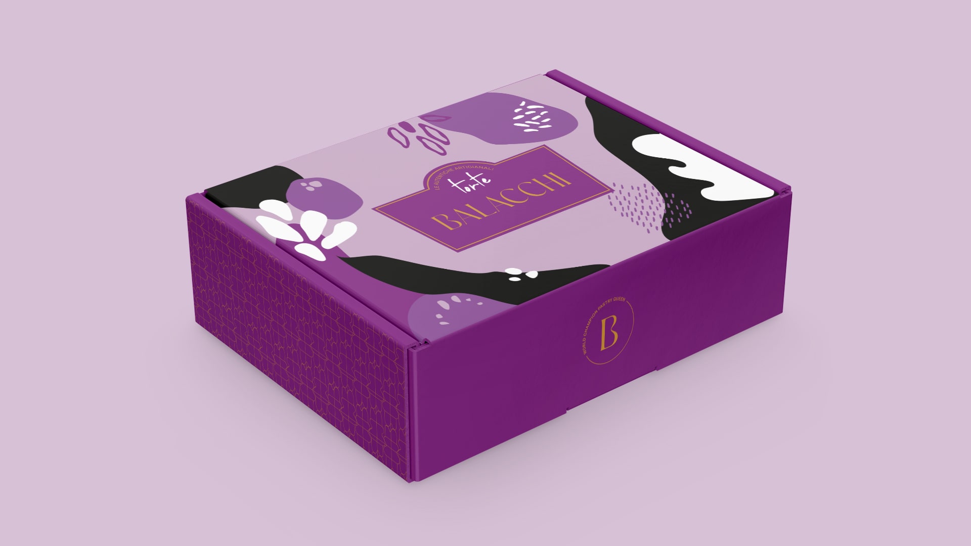
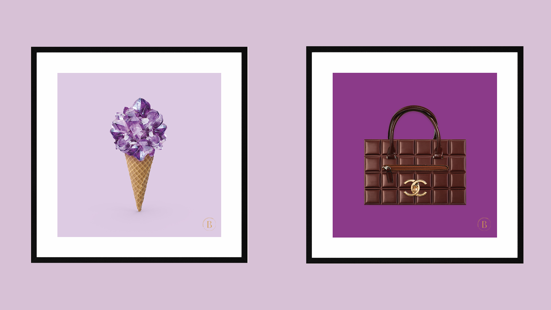
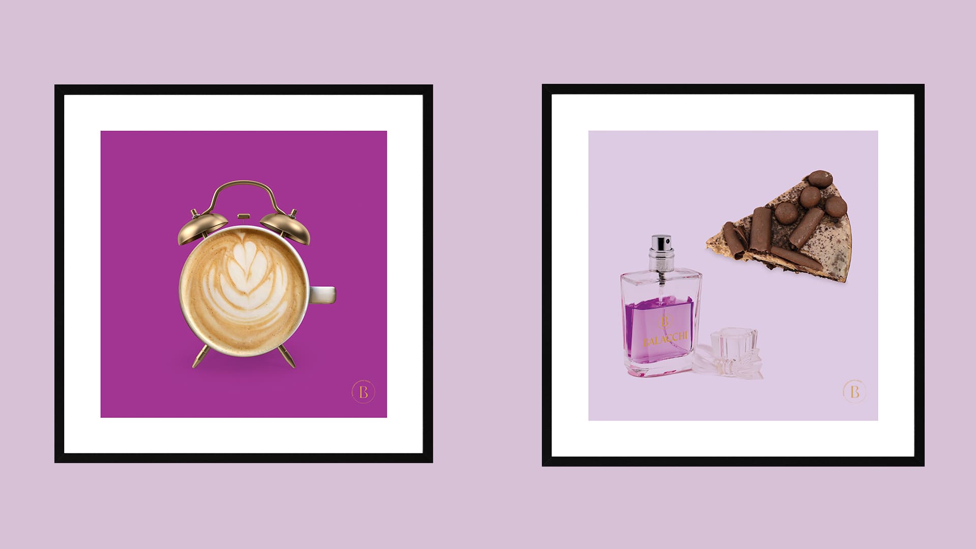
A simple and elegant font was chosen. Uppercase and thin. Vintage, but in a modern way (Innovation Through Tradition). The “B” becomes monogram (Trace the shape of the Gelato balls). The colors mean: Creativity and High Quality, Purity (purple – gold – black – white). The materials used and the descriptions are to indicate Sustainability. The Authenticity of the Ingredients is underlined by storytelling, through social channels.